As a father of three school aged children, I get a lot of communications from teachers, school and the school system. Our school system uses the Synergy suite of school management and communication products. I have the “pleasure” [snark heavily implied] of getting to use the ParentVUE app to get details about my kids progress.
ParentVUE is, without exaggeration one of the most confusing apps I’ve ever used.
The Simple Things
Trying to do the simplest tasks on ParentVUE are baffling.
Jobs to be Done as a Parent
- What assignments does my child need to turn in?
- What is their current grade?
- What do I need to do as a parent? (Follow-up, schedule a conference, look at a report card, etc.)
- How many days of school have they missed?
- What events are coming up?
- How do I contact their teacher?
To me these are the most critical jobs to be done and the UX should reflect that.
Current Parent VUE User Experience
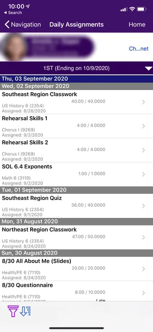
With a confusing hierarchy of webviews, that all feel like they they are all from different planets, the information is dense, obtuse, and focused on the wrong details.

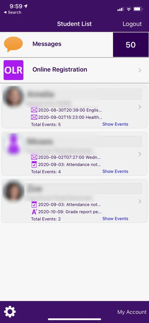
Main / Overview Screen
- My kids are registered, why do I see registration link?
- The events and notifcations for each kid are truncated and no important information is visible
- listed below are not useful to me.
I would rather see a roll-up of grades, missed assignments, and other things that I need to take action on.
Inconsistent
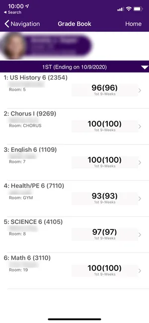
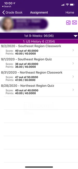
I’ve found at least 5 places on the app that show current grades or reports cards. EVERY representation is different.


Scope
For the purpose of this project I decided to focus on just the mobile app experience. The following is out of scope for this project:
- Emails or Notifications
- Desktop web experience
- Customizations
- Full feature parity with the existing experience
My approach
- Focus the experience on the most important jobs to be done for a parent (I
- Create a clear IA & hierarchy
- Design a consistent visual, and interaction language
- Create a scalable system that can be customized by any school